AI + Human Support
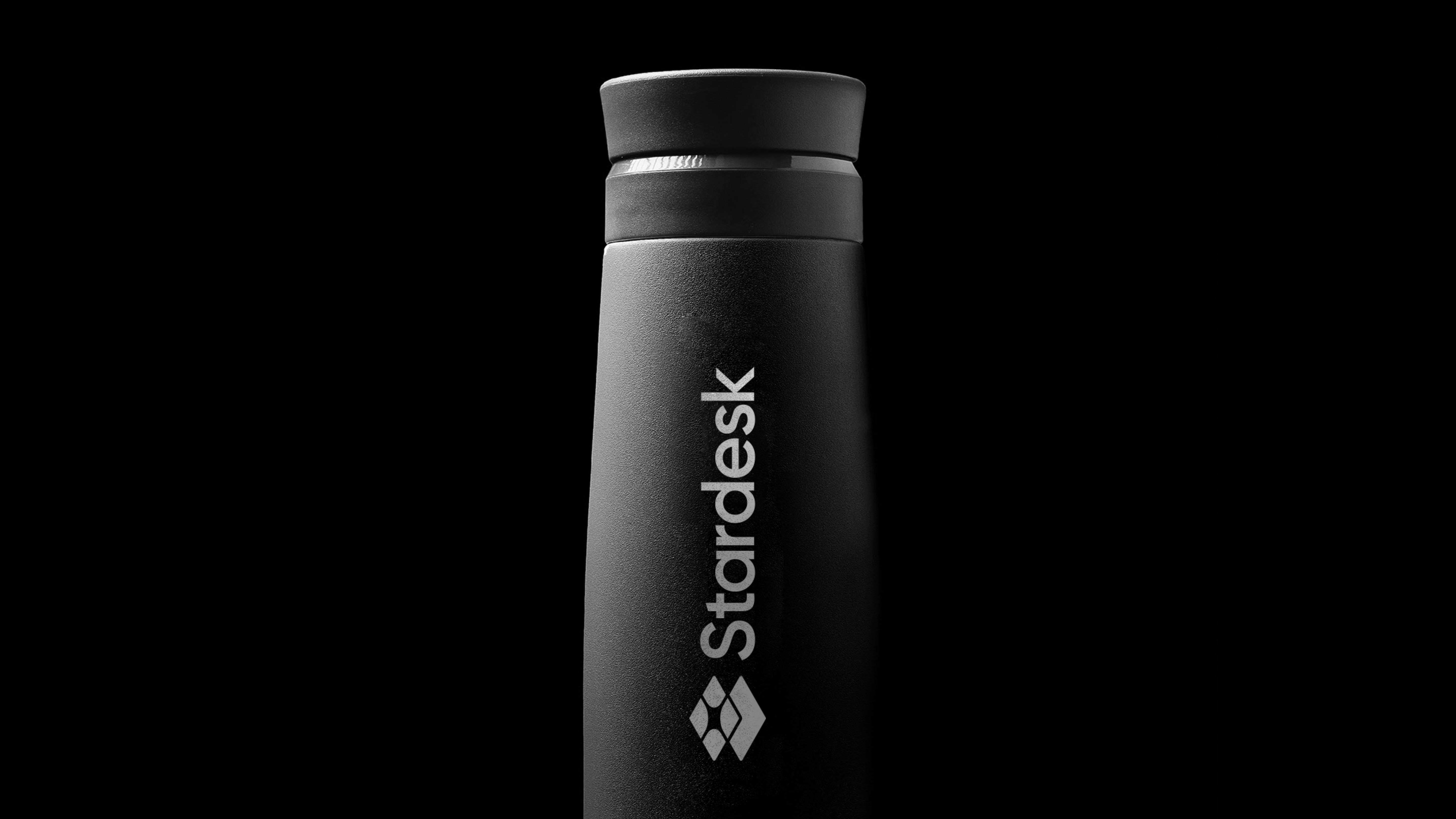
The logo combines a modern, minimal, and strong symbol with clean typography. The geometric form, inspired by a star, merges with the concept of a desk/interface representing “support,” visually conveying both the space theme and the functional nature of the product in a single mark.
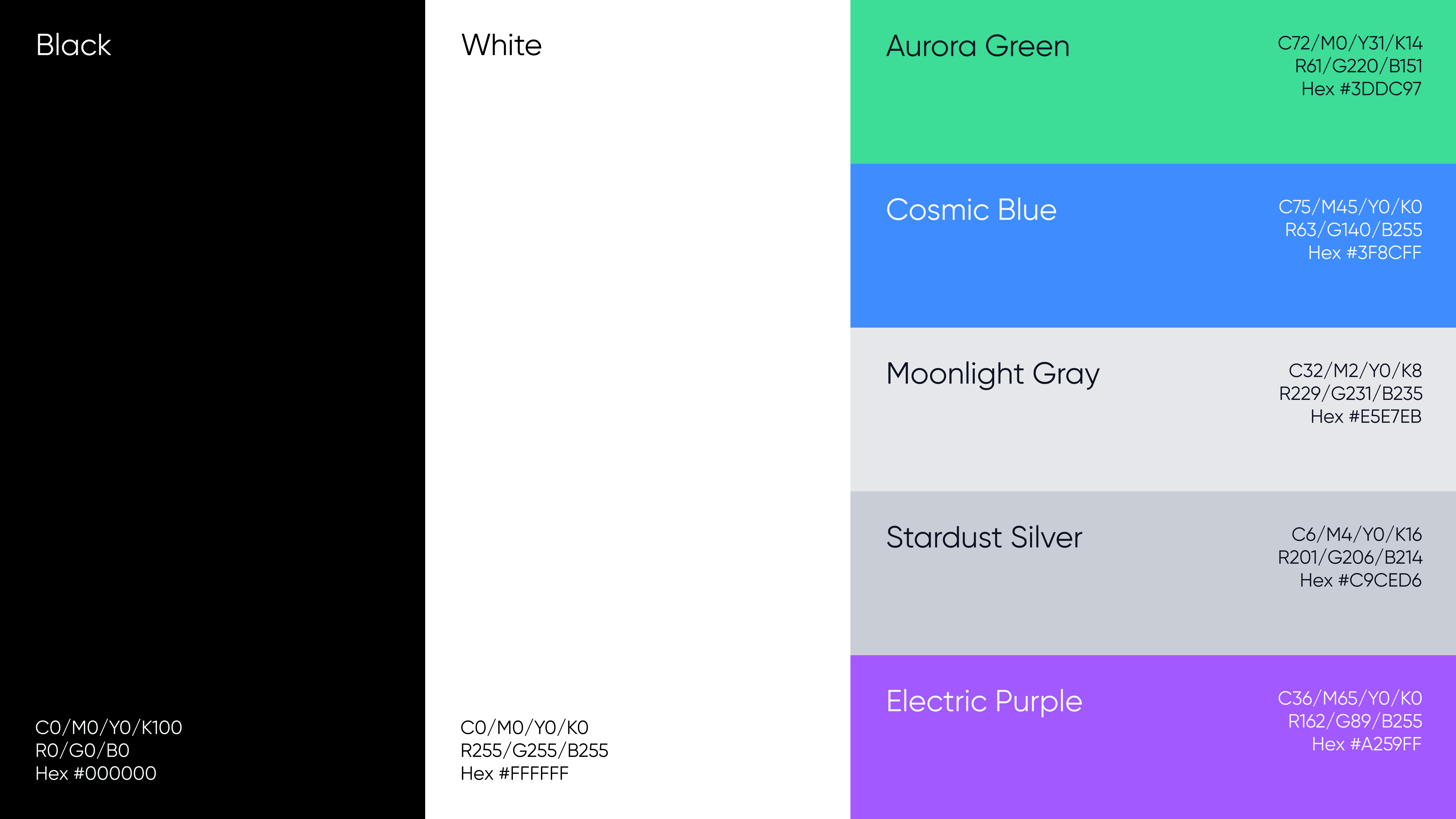
The color palette—featuring cool and neutral tones such as Aurora Green, Crown Blue, Moonlight Gray, Stardust Silver, and Helium Purple—reinforces the brand’s technological and trustworthy character. These colors have been optimized for high readability, contrast, and a premium feel in digital interfaces.
The Gilroy typeface balances a modern and professional look with a friendly touch through its rounded forms. Clarity, balance, and readability have been prioritized in both headings and body text.
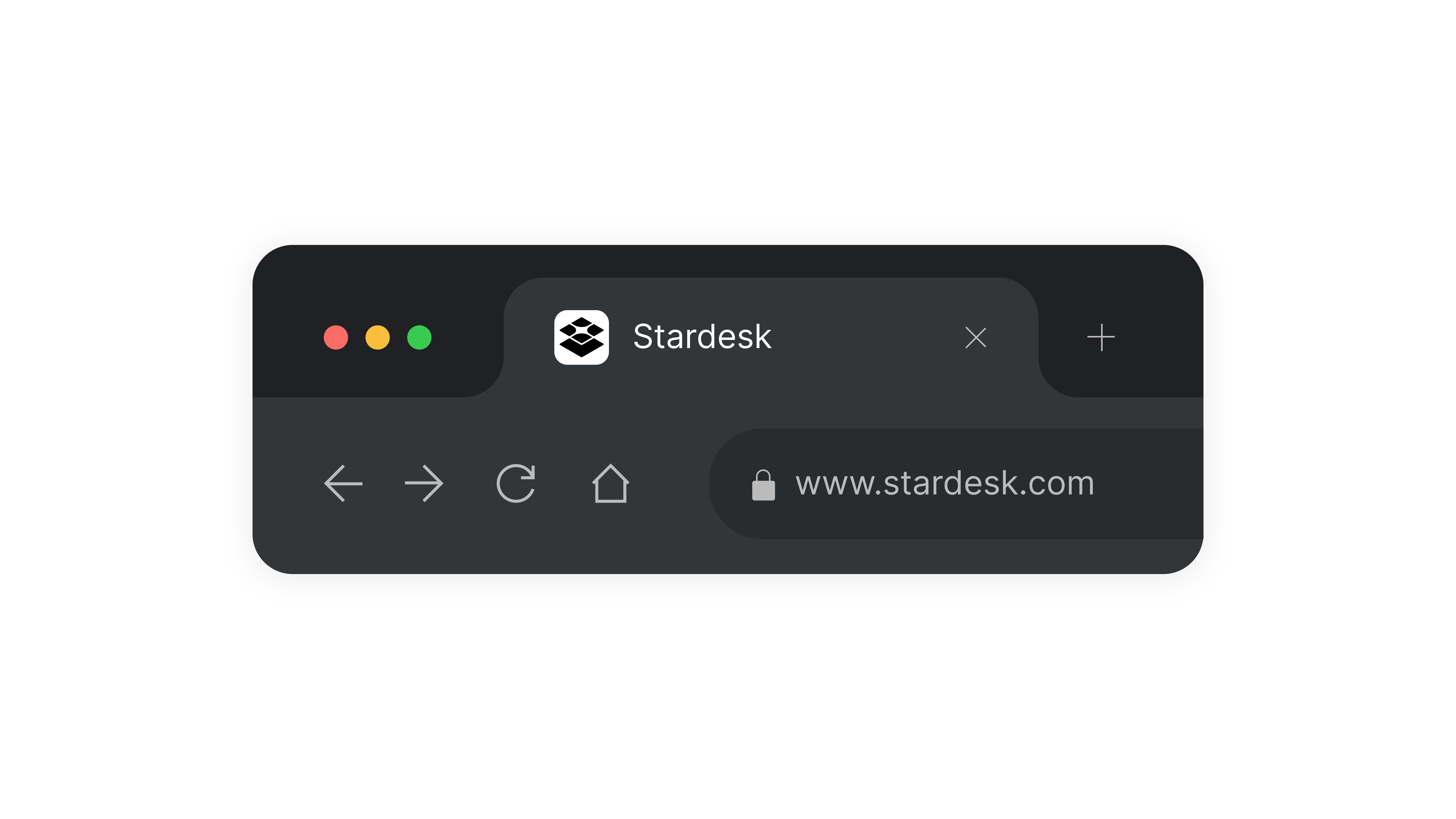
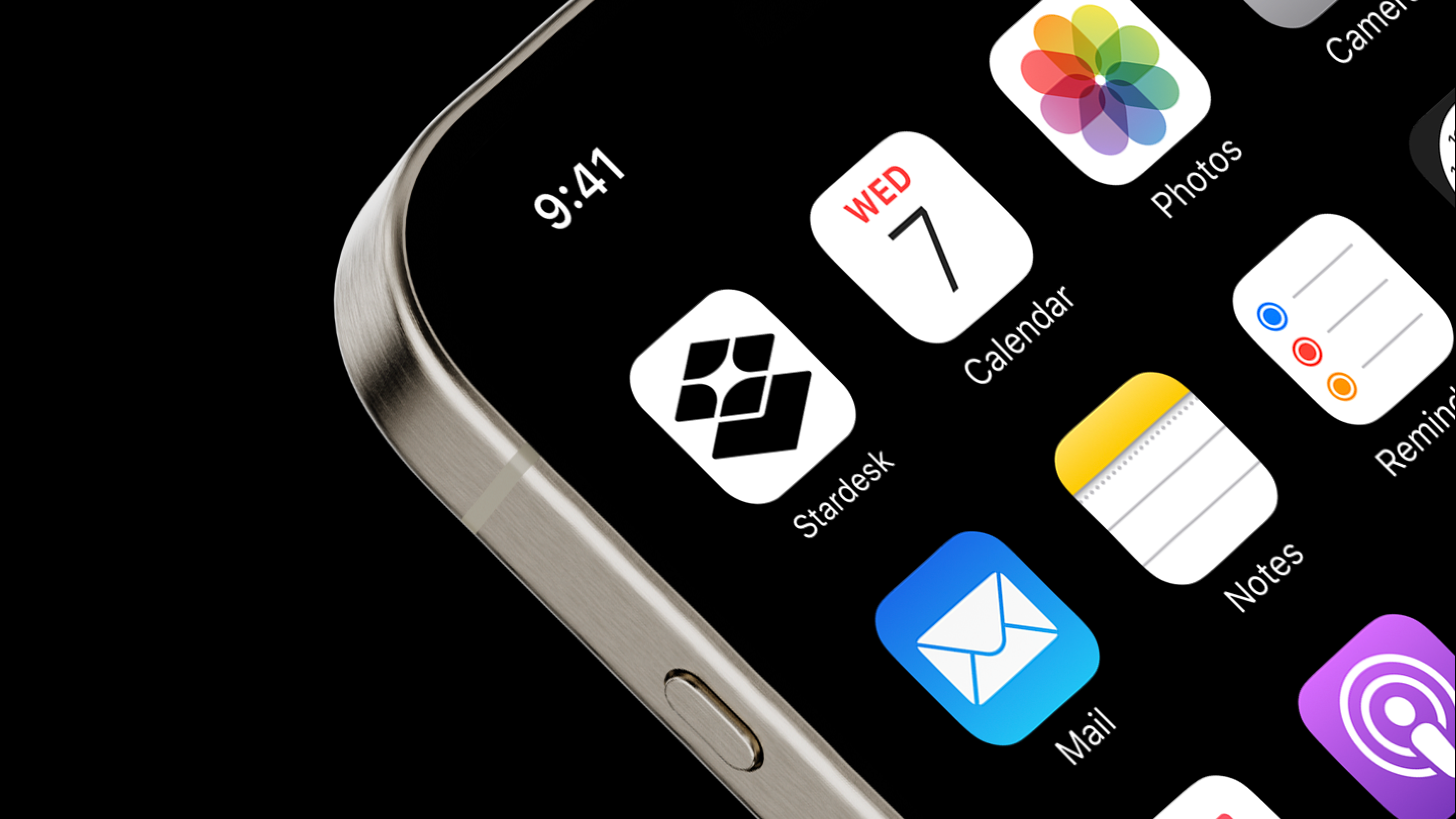
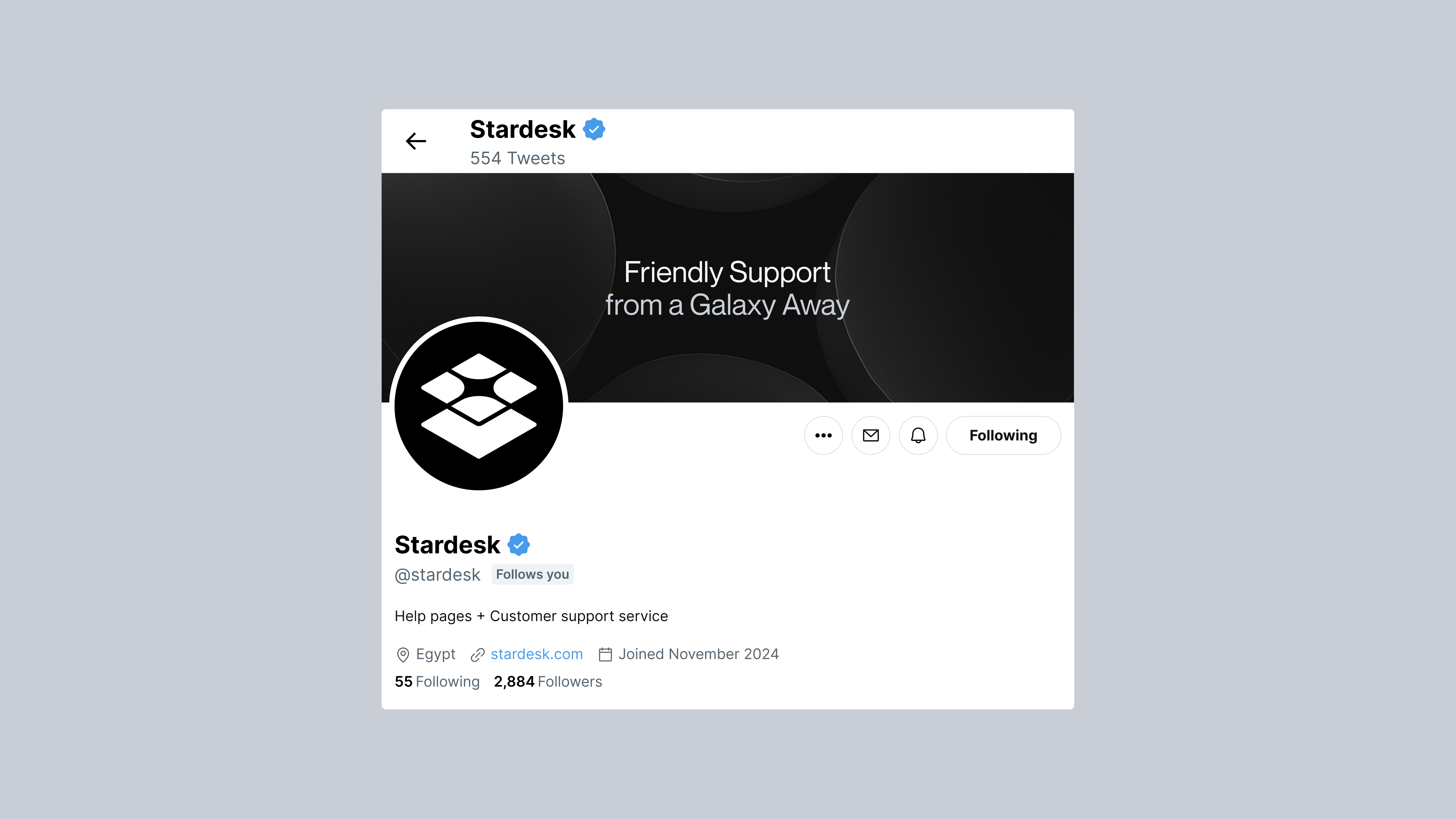
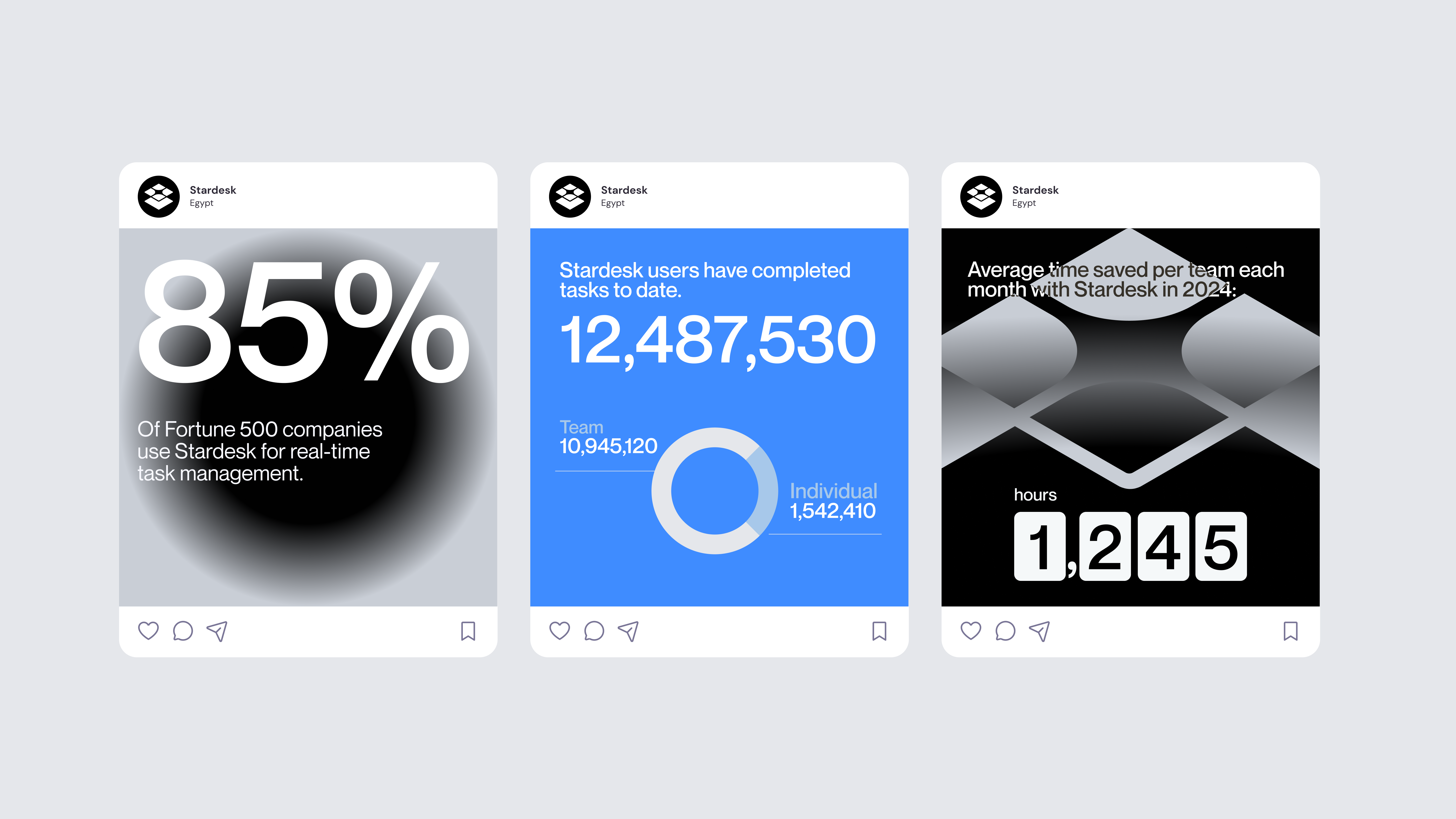
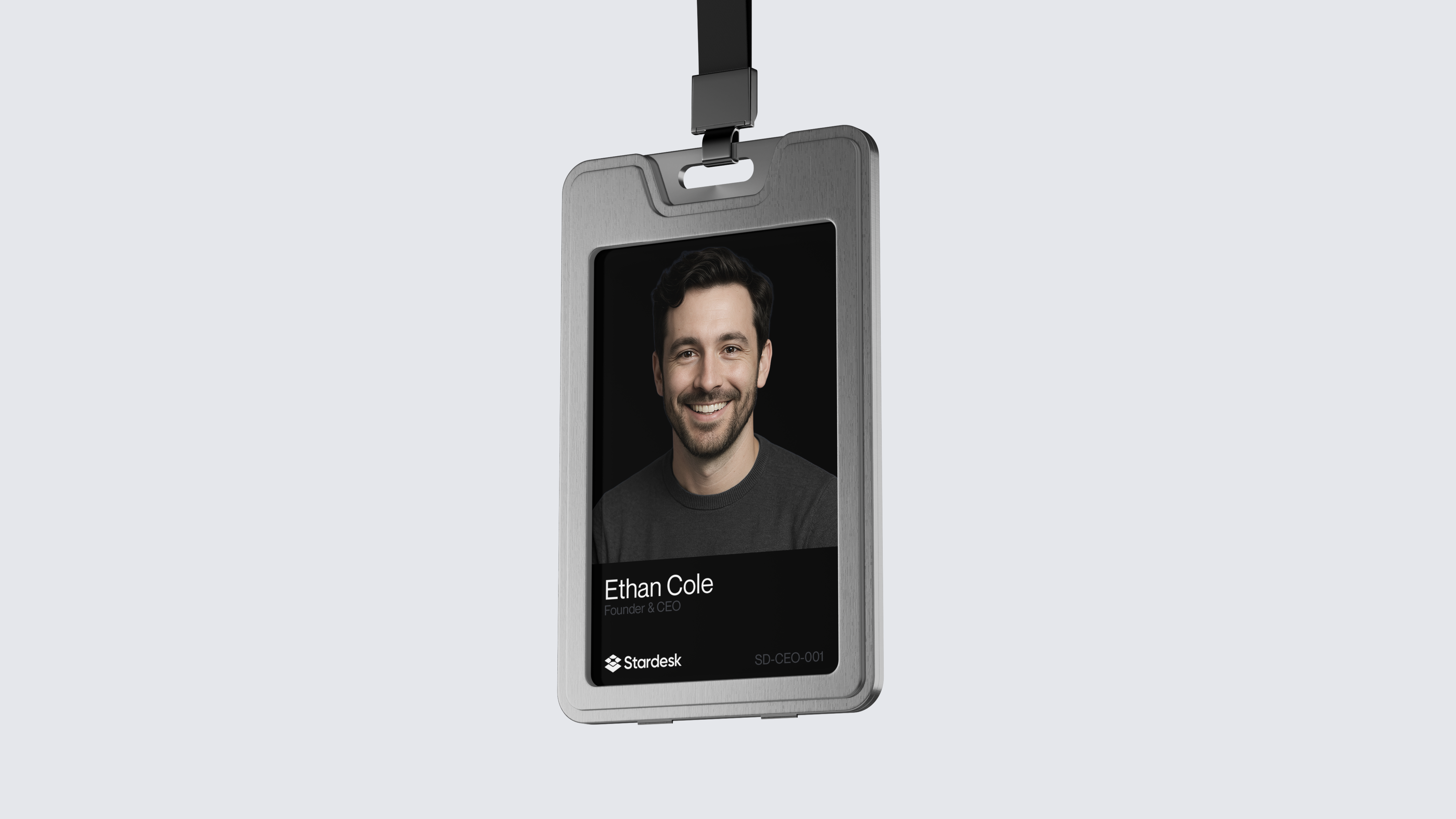
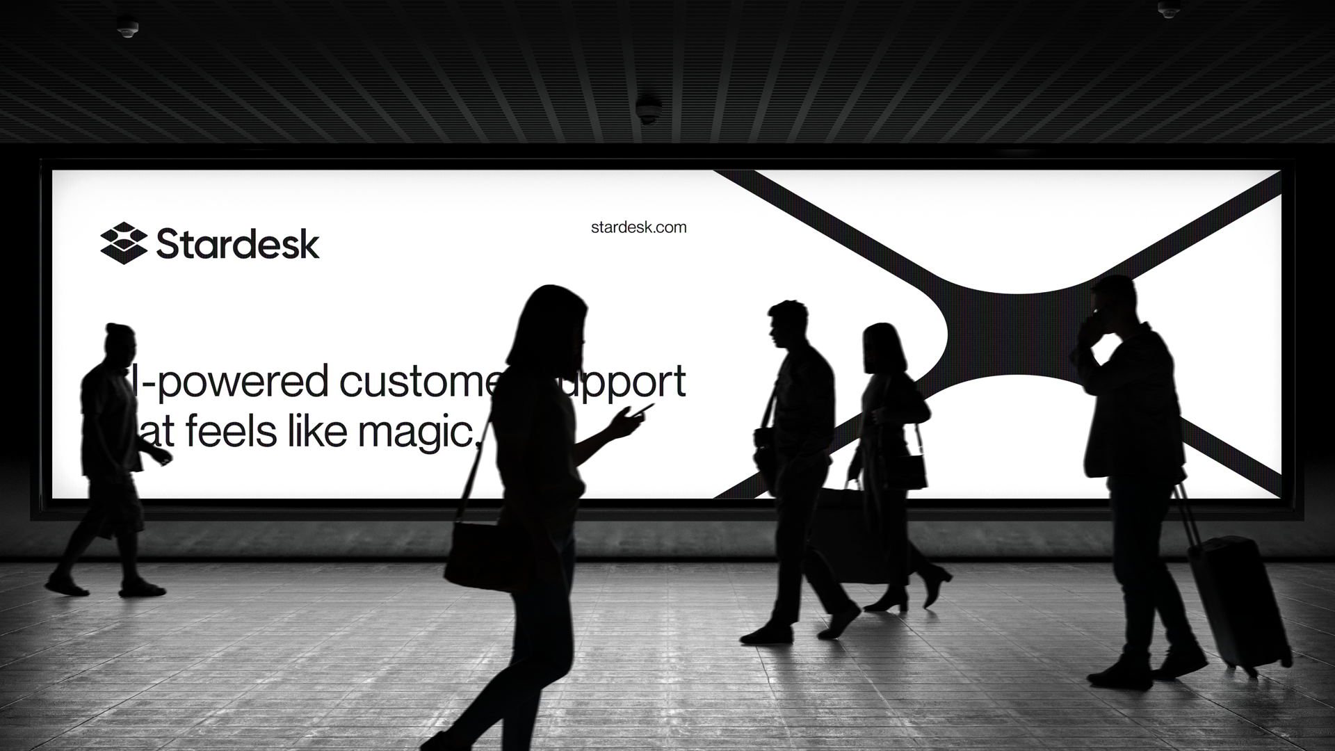
The visual language is applied consistently across multiple touchpoints, from social media content and mobile app icons to product interfaces, promotional merchandise, and outdoor advertising. Social media designs, built around a statistics-focused and minimal composition, convey trust and expertise, while product interfaces present AI-powered support features within a modern dark theme. In physical applications, the brand identity is brought into the offline world through ID cards, tumblers, and billboard designs.